

How to turn visits into bookings: express diagnosis
direct bookings
how to improve conversion rate
guest experience

Getting traffic is not enough. To convert it into bookings, your website must work as a clear, fast, and persuasive tool. This article offers an express diagnosis to identify common mistakes and improve them without redesigning everything from scratch. It’s especially aimed at independent properties that want to increase direct bookings without relying solely on OTAs.
According to the conversion-centered design approach, every element on a website should guide visitors toward a specific action: the booking.
Why your website matters so much
Your website is the first real impression potential guests get. If it doesn’t communicate clearly or creates friction, they’ll likely go somewhere else. A great digital experience can be the difference between a lost booking and an instant conversion. More than 70% of people abandon a website if it’s slow or unclear on how to book. A well-optimized experience reduces cognitive load: fewer doubts, fewer clicks, more bookings.
Common website mistakes that might be hurting your bookings:
1. The site doesn’t address what guests need
Many websites focus on the property, not the guest experience. The UX (user experience) approach suggests sites should align with the goals and motivations of their visitors.
How to improve it:
Show who the property is ideal for (families, couples, solo travelers)
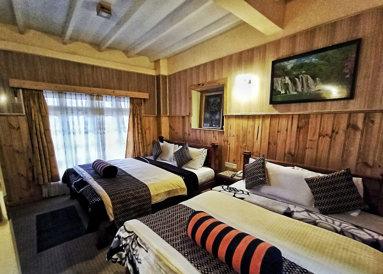
Include real testimonials or images
Use empathetic language focused on concrete benefits
The Jobs to Be Done framework helps align content with the guest’s real intentions.
2. The design is not mobile-friendly
Most searches and bookings happen on mobile. If the site is hard to navigate on a small screen, you’re missing out.
How to improve it:
Test it on different devices
Use tools like PageSpeed Insights or GTmetrix
Optimize images and simplify the layout
Google estimates that 53% of users leave a mobile site if it takes more than 3 seconds to load.

3. The booking button is not clear
It may seem basic, but if the booking button isn’t visible or understandable, it won’t be used. This is one of the most common and critical mistakes.
Checklist:
Is it visible without scrolling?
Does it stand out with a bold color?
Does it lead directly to the booking engine?
Tip: Place it in the menu and at the top and bottom of every page. Based on visual hierarchy principles and heatmap studies, users tend to scan in an “F” or “Z” pattern—strategic button placement is key.
4. The copy is too generic
Phrases like “live a unique experience” no longer connect. What works today is a human, specific tone that matches your property’s identity. How to improve it:
Review content and replace clichés
Use real guest quotes
Reflect the spirit of the place
A clear, authentic voice doesn’t just inform—it builds trust and brand. It helps differentiate in a saturated market.
Real case: what happened when Nico updated his website
Nico managed a hostel in Cusco with good occupancy but few direct bookings. With small changes—like a more visible button, clearer texts, and more realistic photos—he increased direct bookings by 22% in two months.“It wasn’t magic. I just made the site respond better to what my guests are looking for.”
How it connects with other business areas
This express diagnosis is part of a broader strategy. Improving website copy is important, but without consistent WhatsApp communication or an efficient booking system, the effort falls short. That’s why this article connects with:
Communication strategy: how to define a clear and consistent style
Ready-to-use templates for WhatsApp and email
Common digital service mistakes (and how to fix them with AI)
Final tips to improve your conversion rate
You don’t need to start from scratch. Sometimes, small adjustments make a big difference:
Use tools like Hotjar or Google Analytics to understand how users navigate your site.
Track clicks and conversion rates, and test improvements gradually.Remove friction points: confusing copy, hidden buttons, or unnecessary steps.
to see how Aloha can help centralize your bookings and improve the guest experience from the first click….


